Authors

Latest comments

Contact

Lagrafica

5 Schooner Way, Cardiff,

CF104DZ


T:  +44 (0)7782 660 855

E:  dan@lagrafica.co.uk

Welcome to the Blog

This is where I will be sharing my thoughts and ideas about design related stuff, from the trivial to the (hopefully) thought provoking. Enjoy...

Lagrafica Joins Nuance & Fathom

Bringing you more opportunities to maximise your brand...

Lagrafica has been delivering great design since 2005 and I'm pleased to announce that, as of this July, I am merging with Cardiff and London-based brand response agency Nuance & Fathom.

Don't panic! You'll still get the same great creative services as always, but now I've got some mates to help me. Not only that, as part of Nuance & Fathom, your business can take advantage of a whole new range of services, all designed to maximise customer response and build brand recognition.

Nuance & Fathom are a talented and experienced team of analysts, strategists, developers and creatives who specialise in building captivating relationships between brands and people - engagement just isn't enough. Their superior understanding and application of data enables the successful integration of traditional communication methods with online, mobile and social media ensuring the best possible results are achieved. Their work is National, it's Global but it's always one-to-one.

As you might imagine, I'm pretty excited about what the future brings. Not only for myself as part of the Nuance & Fathom team, but also for waht I am now able to do for my clients. I'm especially excited to be able to offer a wider range of services and expertise to you, and would love to have a chat about it sometime.

In the meantime, please take a look at www.nuanceandfathom.co.uk for a flavour of the work we do and who we do it for. If you'd like to arrange an appointment to discuss your marketing, or just want to tell me how lovely the new website is, please do not hesitate to get in touch - I'd miss you otherwise...

Posted by Dan at 16:44 on 15/07/2013

The 'Blue Person' Wins 360 Legal Marketing Award!

Long time no blog, sorry! I've been busy working with Paul Hewett to build up the Zeno Marketing project list, and things are bubbling along nicely now. If I haven't told you about Zeno yet, remember to ask me next time we speak or visit www.zeno-marketing.co.uk

But the reason for the latest post is to congratulate Clive Thomas and all at Watkins & Gunn Solicitors for their recent win at the 360 Legal Awards in the 'Most Innovative Marketing Idea' for the blue man concept.

For those of you who haven't yet seen the blue man (or blue person for the more PC among you!), he's a very busy little boy, representing the multiple facets of Watkins & Gunn's services and occasionally representing ideas, articles and marketing opportunities they may have. You can see how he's doing at www.watkinsandgunn.co.uk

The brief was to avoid the classic stock photography representation of their services and make them stand out from their legal industry competitors and give their brand a memorable personality. I developed the concept of the androgynous blue man, but much credit must go to W&G for how they've taken the ball and run with it (all the way to the Millennium Stadium!), using it for sponsorship of local sports teams, Wales international rugby matches, in local newspapers, internal magazines and across their wide range of marketing materials. The blue man is now the memorable face of the company, even though he has no face!

So if you need to add some character to your marketing, then give me a shout!

Posted by Dan at 16:08 on 08/10/2012

Designing Out of My Comfort Zone

Most designers will eventually settle into a particular 'style'. Some find that illustrative graphics are their thing, others develop a very clean minimal style, and everything inbetween. Good designers are usually able to move between styles depending on the client, rather than enforcing their own prescrpitive style on a job.


I like to think that I've been able to do what's right for my clients, finding the right approach for each client. However, I recently found myself a little bit out of my comfort zone on a recent project - a 180 page coffee table book for lovers of a vintage lifestyle. 
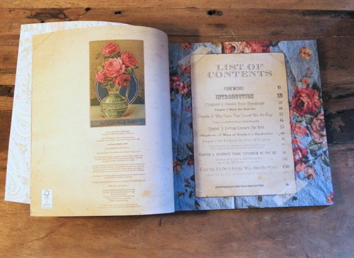
 

Home Book 2


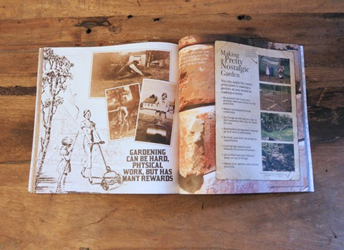
The book is Pretty Nostalgic Home, and was written by Nicole Burnett and Sarah Legg, who run a vintage and artisan market in South Wales. The book is a must for those interested in developing a vintage home, from the kitchen to the garden via celebrations and tips for buying the right stuff.
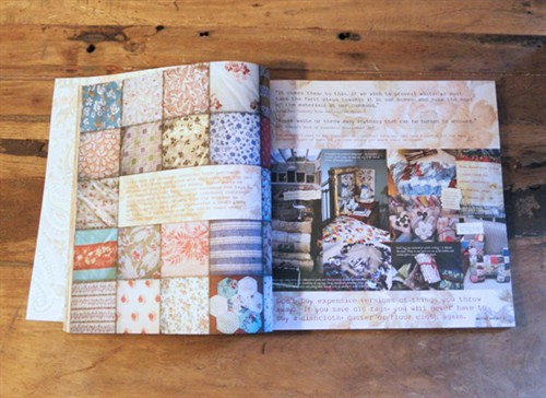
 

Home Book 3


As you'll see from the images, the book required a very distinct visual identity. The writers wanted to create a  'scrapbook' approach, with the photos and annotations appearing as if they've been stuck in with love. To further develop the scrapbook illusion a handwritten font and cut out bits of paper were used to good effect.
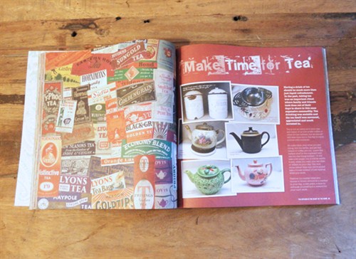
 

Home Book 4


However, as most of my clients have had at least some semblance of a corporate edge I had become accustomed to certain 'givens' in my design approach - I expect everything to line up nicely where required, I still enjoy using white space to direct the eye (my instructions for this even included not leaving any white spaces!), I expect there to be a distinct focus on each page - but on this project I almost had to unlearn many of the things i've learned in my professional career and take a step back to my days of keeping a sketchbook on art A-level and the like.
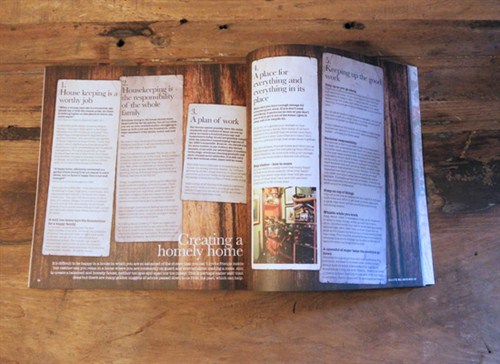
 

Home Book 5


Having gone through that process I'm very pleased to add the project to my portfolio, not only as a creative success, but as a lesson that an old dog can learn some new tricks, making sure I keep on my toes and not take any styling issues for granted.

You can purchase the book on Amazon  http://www.amazon.co.uk/Pretty-Nostalgic-Home-Happy-Vintage/dp/0957133901/ref=sr_1_1?ie=UTF8&qid=1331300928&sr=8-1 . Please let me know what you think of it.
 

Home Book 6

Posted by Dan at 14:19 on 09/03/2012

UKTV - The Circle of Trust

I'm often asked what my favourite logo of all time is, and as there's so many great identities throughout history and with different reasons I find it difficult to say. However, a current brand I find really effective is the UKTV brand.

You may not be familiar with the name or the company logo, but you're bound to be familiar with the product. They're the company behind digital channels Dave, G.O.L.D, Watch and many others.

UKTV Logos

Why i like the brand is not for the UKTV identity in its own right, but how each channel is represented by its own individual icon, but is tied together through one common element - the circle. You may not have openly noticed it before, but this subtle iconography reassures you that you're watching a 'proper' channel, while also remaining individual enough to represent the subject matter or content of each channel appropriately.

Essentially, the lesson is that sub-brands and divisions need not be simple colour change variations of the masthead logo, but can be interesting and vibrant entities in their own right while remaining true to the parent company's values.

www.uktv.co.uk

Posted by Dan at 20:51 on 07/12/2011

The first of many...

I'd like to welcome any readers to the new Lagrafica blog. I plan to upload interesting images I come across, write about things that interest me in the design world. Hopefully you'll find it useful and stimulating too!

Let's see eh...

Dan

Posted by Dan at 19:48 on 18/11/2011