What Makes a Good Logo? - Part 5: Tech Stuff
And finally...
We've got our finished logo and we're happy it's a successful solution, so what do we do with it?
Trademark the logo (or use a TM at the very least).
Well we've gone to the trouble of investing in the logo, so we don't just want someone to steal it, so we need to protect it. Approving your trademark, the little R in a circle, isn't usually an overly complex process, but consult a good patent attorney or copyright lawyer to conduct the relevant searches for you. But if you can't afford to trademark your logo you can still put the little TM on the logo to indicate that it's being used in a trademark context. This costs you nothing, and could prove useful if someone challenges your logo.
Create a brand guideline booklet
You know how your logo is going to be used and maybe even some of your employees will know how it's going to be used, but will a new employee, or new consultancy understand how the brand should be used. A brand guideline book, indicating how a logo should sit on a page, colour references, fonts and sizes used, and in which situations they are used, is an invaluable reference tool for a business, especially one with a number of employees.
Use it as often as you can
Now you've got the logo, use it everywhere. This will only serve to enhance brand recognition and brand credibility.
Ask for a copy of the logo, in a number of formats on a disk, and ensure you have a vector (EPS, AI) version of the logo.
Make sure you've got a copy of all the relevant logo files, in a number of formats, in CMYK for print and RGB for screen and web, and especially a vector version. Normally these are EPS or AI files, but you'll need this format for using the logo on anything else as it's scaleable and will not lose any quality if it was 20 feet tall or 20mm tall. A JPEG, BMP or a TIF will reduce dramatically in quality if it was enlarged.
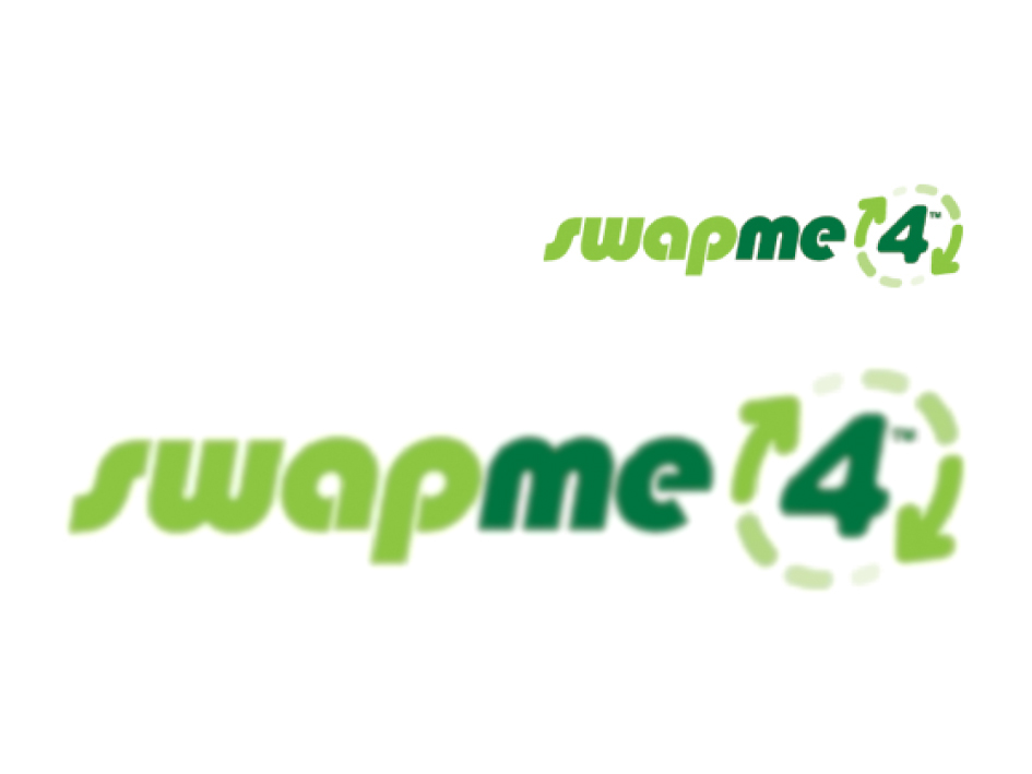
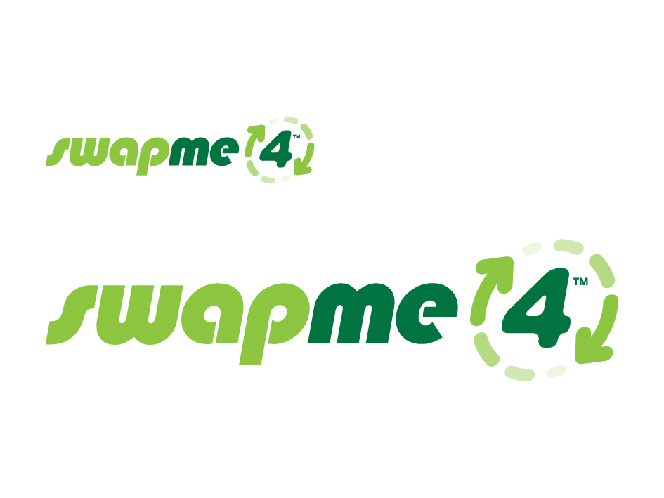
Hopefully this graphic will explain the difference between bitmap (that's your JPG image) and vector. While they look similar when smaller, when enlarged the bitmap version loses quality leaving a jagged edge, and a slightly grey halo around the text. Imagine if the JPG logo was enlarged to fit the side of a car or shop front, and it would look awful or may result in being charged for having it redrawn, which is where having a vector copy of your logo is essential.